What's making me blue?
Traditional brown and gold, or a splash of colour? Our new merch guru AJ has a look at the 2024 range of HFC apparel and gives us his overall verdict.
Subscribe to Hawks Insiders for all the news through Hawthorn-tinted glasses and more exclusive content.
We love our colours.
We all have brown and gold flowing through our veins.
But one thing we’ve realise - basically since the move from Puma to Adidas in 2013, is that our club using other colours in merch is probably a good thing.
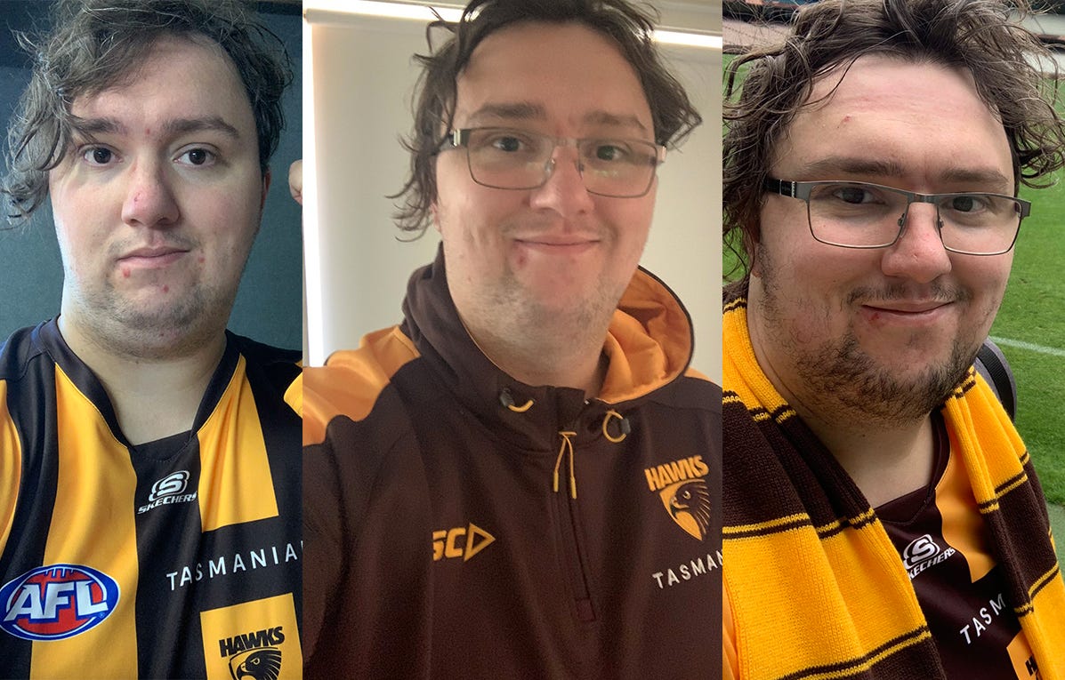
I’m someone who wears club merch more often than not (whoever said you should stop wearing a guernsey to the footy after the age of 12 clearly never spoke to me on the subject).
And I love when our apparel partners deliver something that doesn’t feel overly footbally so you can wear it anywhere, but also know you’re representing our club.
Adidas nailed this in 2021 with the navy blue look, minimalist logos in gold, and the gold three stripe pattern.
When the club moved to ISC, I think people were naturally sceptical about changing from one of the biggest sporting companies in the world to one that, to many, was a step backwards.
When the first ISC kits dropped, the “steel” and “deep water” scheme left many feeling a bit underwhelmed, almost like it was a rush.
That will not be said in 2024.
Carbon
Let’s talk the colour scheme.
We have traditional gold in training tops, singlets and warm up tops, and brown in shorts available.
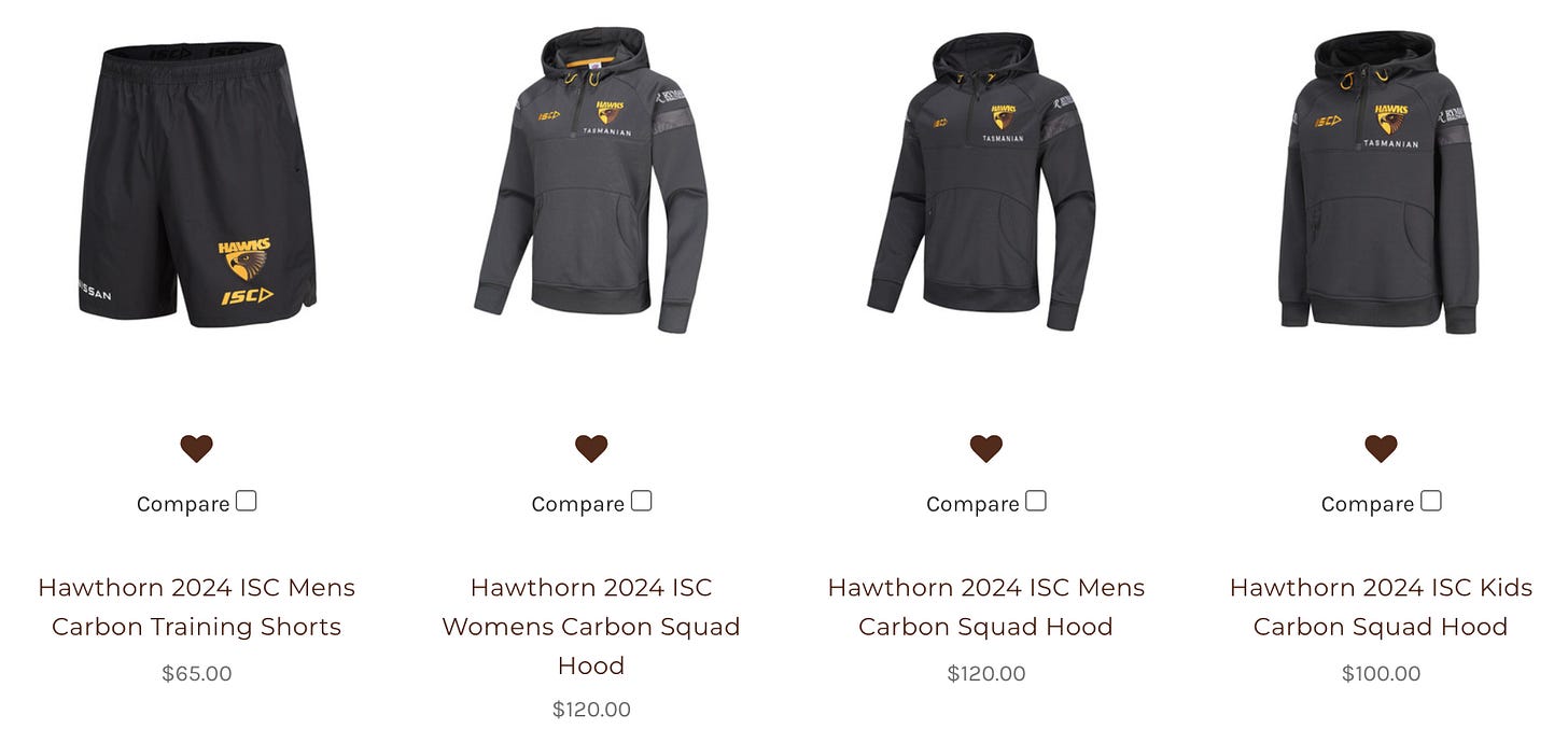
But the big change is the move to the “carbon” theme.
And it looks incredible.
There is no second way of putting it, the colour is just aesthetically pleasing.
The gold accents blend in really well, and especially with the polo shirts and hoodies, it feels like the 2021 kits in that it blends into everyday wear, while also being clearly Hawthorn.
Tarrakukk
One of the things that most stood out last year was our warm up tops, with indigenous art work.
This is back this year, and more prevalent, with the Tarrakukk (Hawk) on almost all the clubs designs, as well as smaller elements of indigenous art on shoulders and sleeves.
It’s something the club is getting really good at in acknowledging our indigenous communities in their designs.
Last year’s indigenous guernsey was, in my opinion, the best we have used, and as a Tasmanian myself, seeing Lutruwita on our guernsey made me very proud.
It’s the simple things.
These aren’t major additions to the clubs designs, but they show what matters to our club as we continue to embrace our indigenous culture, and look further into the future.
Armour
So far we have seen just one guernsey, the one we want to see the most.
Three stripes on the back, three on the front.
Perfect.
The brown shoulder piece returns.
While some aren’t fond, I like it.
The club logo remains on the front.
I hate this, but I think it’s because it gives me flashbacks to the 2004-2005 guernsey, and to the many awful games of football we watched in that time.
There is no official indication from the club on secondary jumpers.
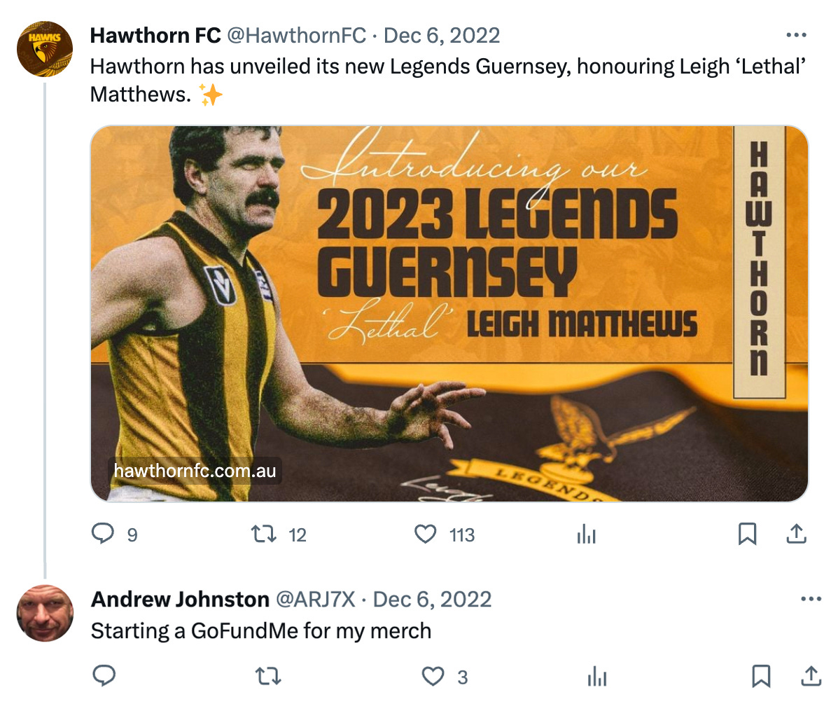
The legends jumper project continues into a fourth stage and after already honouring Kennedy, Hudson and Matthews, it is Michael Tuck’s turn.
Whilst I love the concept, mid way through last year I changed my mind.
It was when we rolled out the 90s classic “Big Hawk.” That, in my opinion, should be our new secondary jumper. The fans loved it, it translated well to 2023, and hey, we are 1-0 defeating the eventual premiers in it.
We will see other jumpers this year. I hope to see the Jarman Impey design return for indigenous round - stick with a good thing. We may also see another Anzac jumper.
One thing I will say, the ISC jumpers don’t look or feel cheap. We were all concerned about it, but I think they’ve nailed it.
We shall see what comes next.
Come what may
As mentioned, I think ISC nailed it this year.
The colour scheme is something special because it’s us, but also beyond the club. It hits the best barrier in that you will always know it’s Hawthorn, but you also don’t mind rolling up to the shops in it.
For merch collectors like myself, we look for this stuff. You want something that can represent your club at all times.
If you’re not a guernsey person, you won’t look silly in the carbon polo or hoodie. And if you are a guernsey person, you’ll feel comfortable at the G.
It hits on every level.
It’s not rushed.
It shows who we are, where we have been, and where we are going.
It’s a great look for a great time to be a Hawthorn person.


Hello marketing. Do what you like off the field but when the Hawks are playing footy I prefer the gold and brown stripes